
Why Symmetry Feels Right, and When Architects Break the Rule on Purpose
Symmetry feels right because it is easy on the brain. A balanced facade lets your eye process one half and assume the other, so you understand the whole building in a glance. Architects break that rule on purpose when a site, a view, or a client's life doesn't come in matching pairs, and forcing balance would cost more than it gives.

Why Does Symmetry Feel "Right" to Us?
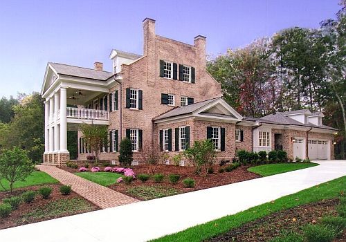
There's a reason Monticello, the White House, and half the houses in Charlotte's older neighborhoods all lean symmetrical. It's not fashion. It's wiring.
Human faces are a good example. We're built to scan for symmetry because, evolutionarily, it signaled health. A face with two matching eyes and a centered nose reads as normal, trustworthy, fine. A face that's off just reads as off, even if you can't say why. We do the same thing to buildings without realizing it. A center door, flanked by evenly spaced windows, with a roofline that mirrors itself, gives your brain a shortcut. It says "I already understand this," before you've consciously looked at more than a third of the facade.
That's not a bad thing. It's efficient. It's also, frankly, a little bit of a cheat code for making a house look put together, which is part of why so many production builders lean on symmetrical elevations. They're playing the odds. Symmetry rarely looks wrong. It just sometimes looks boring.
Do You Really Need to Design the Whole House Twice?
I had a professor in grad school who put it in a way I've never forgotten. He said that with a symmetrical composition, you only ever have to understand one half of the building. Mirror it, and you're done. Asymmetry, he said, forces you to visually digest the whole thing, so you get your money's worth.
I laughed at the time because it sounded like he was grading buildings on value, like a buffet. But he was right, and it's stuck with me through decades of practice. Symmetry is a shortcut for the viewer. Asymmetry demands attention, wing by wing, window by window, all the way across. Done well, that's a gift. You keep noticing new things every time you pull into the driveway. Done poorly, it just looks like nobody made a decision.
When Do Architects Break Symmetry on Purpose?
Real sites are rarely symmetrical, so a strictly balanced house is often a lie the building tells about the lot it sits on. I break symmetry on purpose in a few recurring situations.
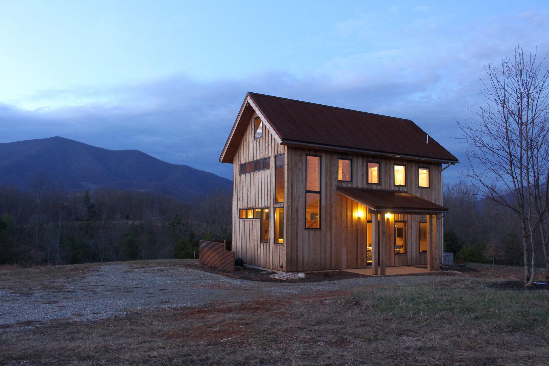
The first is topography. Charlotte has plenty of sloped lots, especially in some of Charlotte's newer neighborhoods (less so in some neighborhoods like Myers Park, Eastover, and near SouthPark), and a perfectly mirrored facade on a sloped site usually means somebody poured a lot of extra concrete to fake it flat. I'd rather let the grade show and let the massing respond to it.
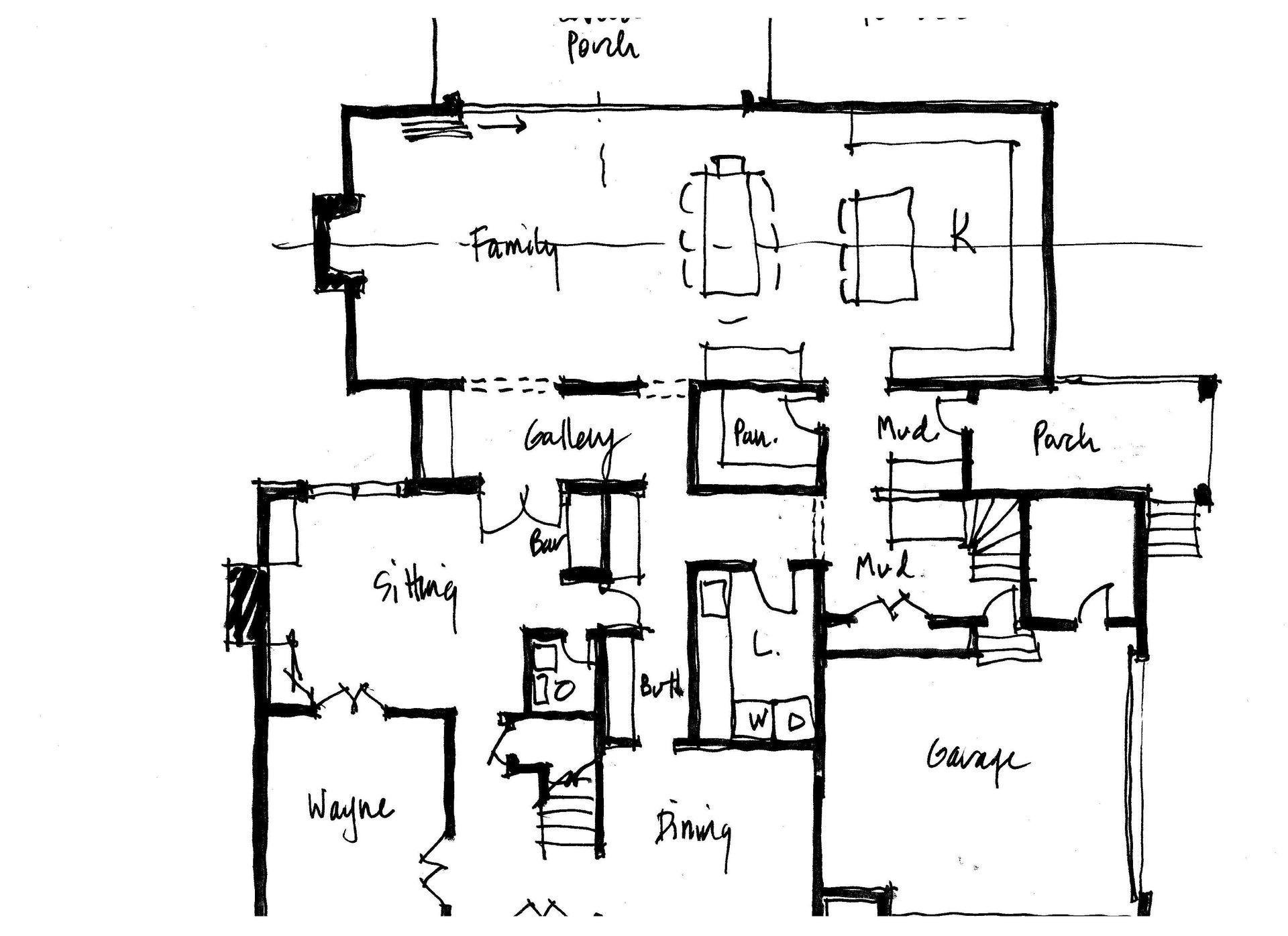
The second is program. A primary suite wing needs different volume than a garage and mudroom wing. Forcing those two very different functions into matching boxes usually means shrinking one and bloating the other until neither works right. I'd rather size each part of the house for what it actually does, then compose the asymmetry so it still reads as intentional rather than accidental.
The third is the view or sunlight. If the best sightline on the lot is to one side, or if you want your rooms arranged to benefit from sunlight over the course of the day, a rigidly centered house ignores its best assets just to look tidy from the street. That's a trade I'm rarely willing to make.
Is Asymmetry Riskier to Get Right?
Yes, and I'll say that plainly. Symmetry is forgiving. Asymmetry has more ways to go wrong, because there's no mirror to bail you out if a proportion is off on one side. As mentioned, that's exactly why so much production home design defaults to symmetrical elevations. It's a safer bet at scale, and there's nothing wrong with safe when you're building the same plan forty times across a subdivision.
But safe and interesting aren't the same goal, and for a custom home, interesting is usually closer to what the client is actually paying for. An asymmetrical composition that's balanced without being mirrored, using weight, texture, and proportion instead of a center line, is harder to design and harder to critique on paper. It's also, in my opinion, more often the difference between a house that looks like a house and a house that looks like your house.
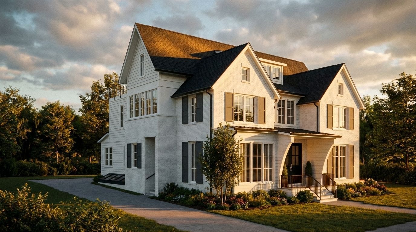
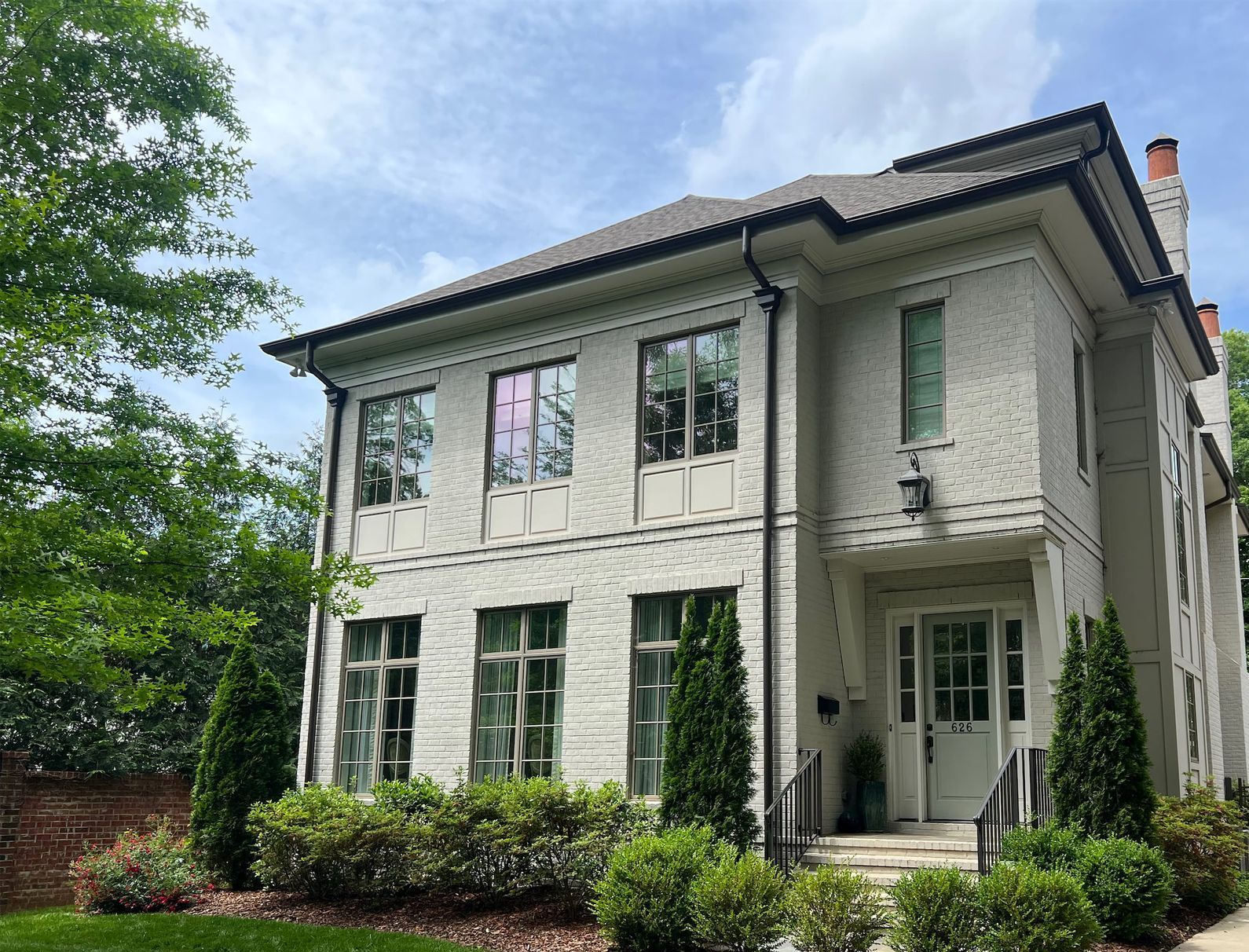
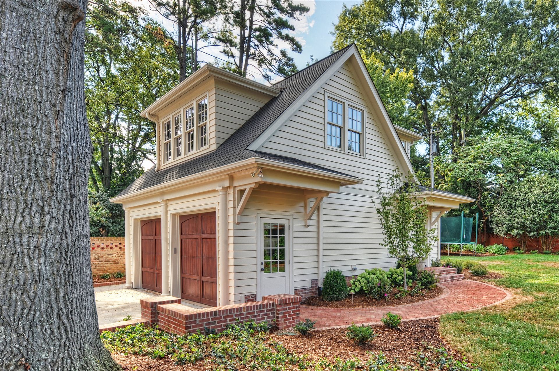
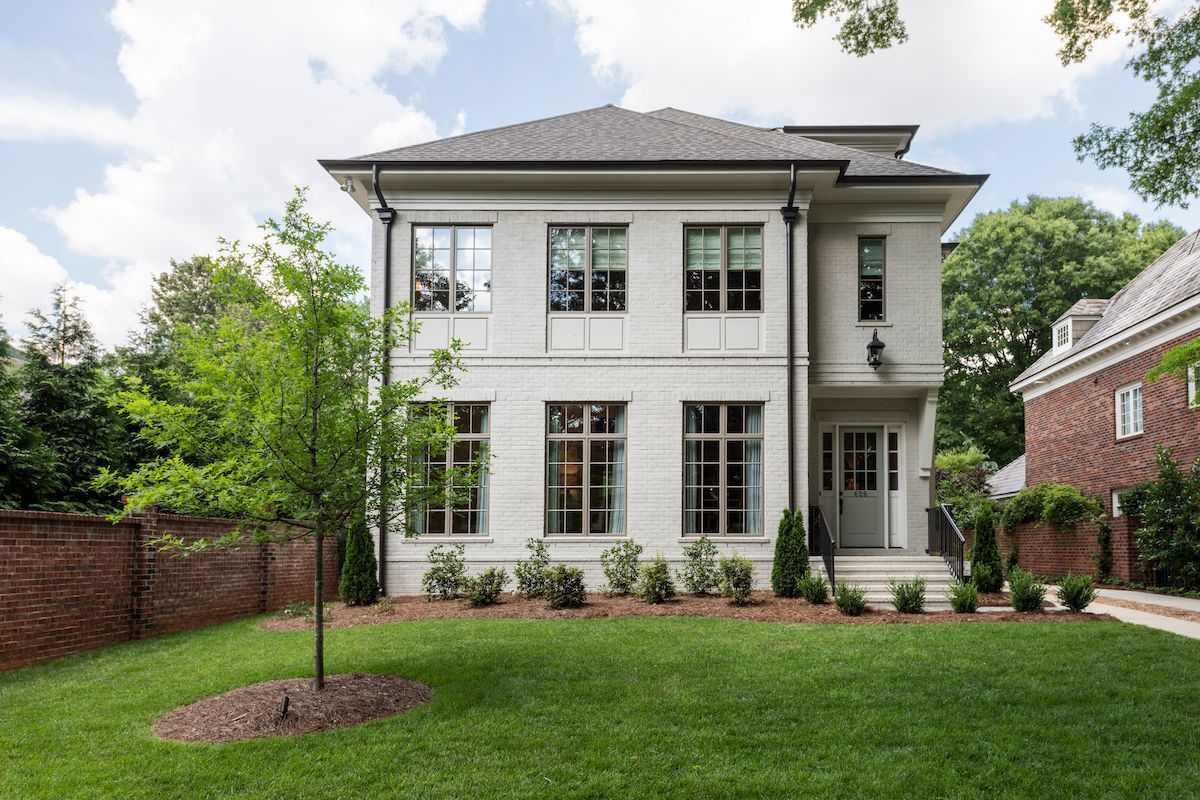
There are, of course, degrees of asymmetry. Here are a few examples where our composition is "almost" symmetrical and it could be argued that, with these examples, you get the best of both worlds.
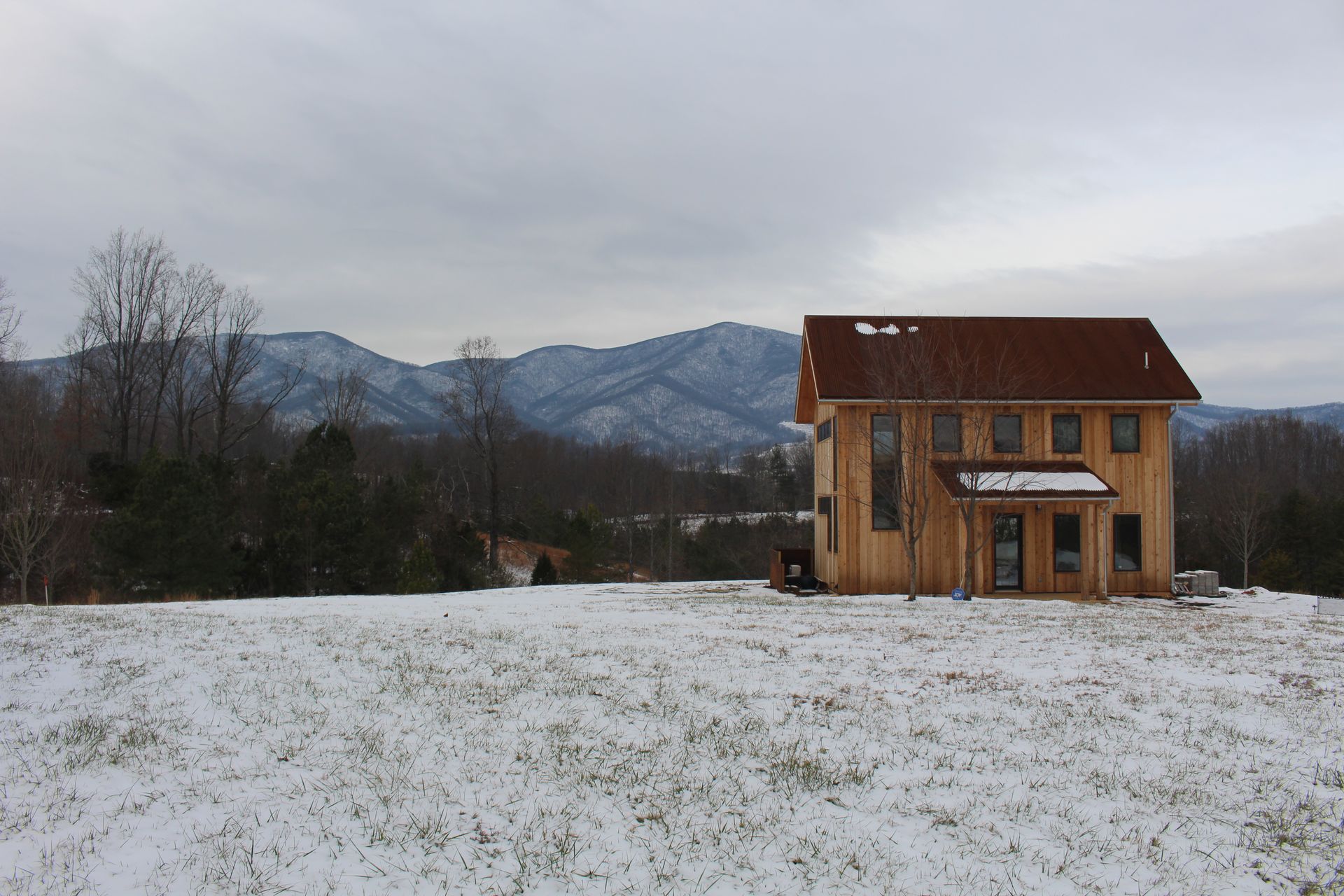
How Do We Decide at Houghland Architecture?
I don't start a design assuming symmetry or rejecting it. I start with the site, the program, and the view, and let the massing tell me which way it wants to lean. If a client's lot, budget, and lifestyle all point toward a formal, centered composition, I'll draw a good one. If the lot is sloped, the views are lopsided, or the program genuinely doesn't split into equal halves, I'll push toward an asymmetrical composition and make sure it still feels resolved rather than random.
The tell, honestly, is whether a design still looks intentional with the symmetry stripped away. A good asymmetrical house should feel like it couldn't be any other way once you understand the site. If it just feels like pieces stuck together, that's not architecture breaking the rule on purpose. That's just an unbalanced building.
Good design, in either direction, should look like a decision, not an accident.
Agree or disagree, please get in touch if you want to have this debate on your new custom house!