
What Makes a House Look Good in 30 Years
A house design that still looks good after thirty years is not built around one particular style. It is built around a set of design principles that work regardless of style, including simple roof geometry, windows sized properly, beautiful proportions, and a limited material palette. These are some of the qualities that give a house a lasting presence, and they are also the things most likely to be compromised when design decisions are driven by fashion, trends, or the desire to make an impression. Good design does not announce itself; it simply and quietly holds up, year after year, while everything around it is screaming for attention. Good design takes restraint, maturity, wisdom, and self-assurance to be truly great. In the words of Teddy Roosevelt (not necessarily about architecture): "Speak softly and carry a big stick."
What does a well-designed house have in common with a self-assured person?
Think about the people you genuinely find impressive, and you will notice they are rarely the loudest ones in the room. The people who carry real authority tend to be quieter about it, not because they are holding back, but because they do not need to perform. That quality comes through without effort, and you recognize it immediately, just as you recognize its absence, even when you cannot quite put words to either one.

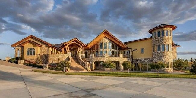
Houses work the same way. A house with genuine design authority has a presence that is difficult to describe but impossible to ignore, something settled and proportional and resolved about it, as though every decision was made with care and simply allowed to be. You notice the house without being instructed to notice it. A house without that quality tends to compensate through accumulation: more rooflines, more materials, stone veneer appearing on one corner and vanishing without explanation three feet later, tall windows stacked against short ones, decorative brackets on a facade that has no structural purpose. Every element is competing for attention, and the cumulative effect is exhausting rather than impressive.
The irony is that the houses working hardest to make an impression are usually the ones that look most dated within a decade. Drive through any Charlotte neighborhood built before 1980 and then drive through one built in the last ten years, and you will feel the difference before you can articulate it. The older neighborhood tends to be quieter and more refined. That is not nostalgia at work. It is the result of a different set of design priorities, ones that favored proportion and restraint over novelty and self-conscious gesture, and those priorities are just as available to architects and their clients today as they were many years ago.
History offers some guidance. The Roman architect Vitruvius argued that a building must satisfy three conditions simultaneously: firmitas, utilitas, and venustas, meaning strength, utility, and beauty. Not one of the three, and not two of the three. All three, in balance, which is a deceptively demanding standard. What makes this framework so durable is that it has nothing to do with style. Colonial revival, contemporary, farmhouse, none of that appears in Vitruvius because it does not matter to the underlying question, which is whether the building is solid, serves its occupants well, and has genuine aesthetic integrity. As an architect and devoted student of history, I could go on at considerable length, but I will not, and will offer some specifics for today's world instead.
Why does the roof shape matter?
Because the roof is the single largest visible element of most houses when seen from the street, and its geometry sets the tone for everything below it in a way that no other element quite matches.
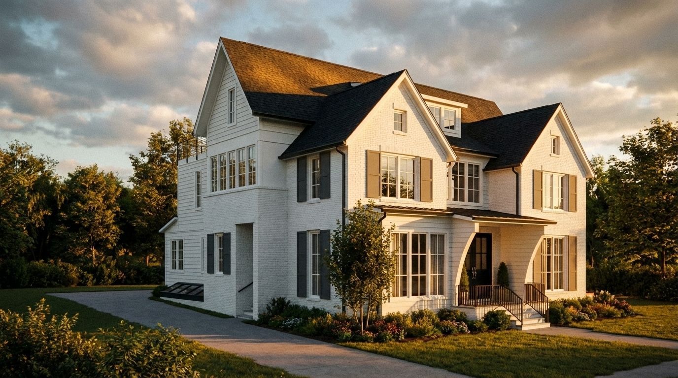
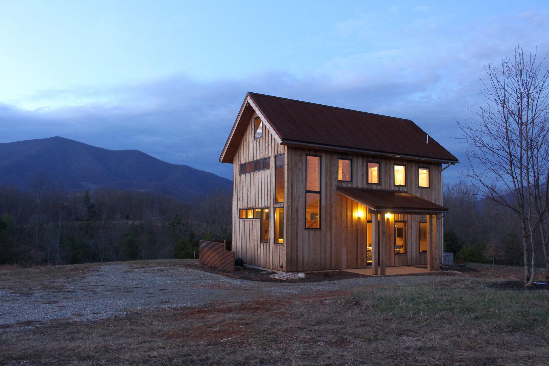
A simple, well-proportioned roofline reads as calm and confident. A roof with six intersecting planes, competing gable directions, and a turret inserted somewhere for visual interest reads as restless and unresolved, regardless of how carefully any individual piece of it was detailed, because the problem is not in the details. It is in the composition. Adding more parts to a roof does not make it more interesting in any meaningful architectural sense; it makes it busier, and busy design ages poorly.
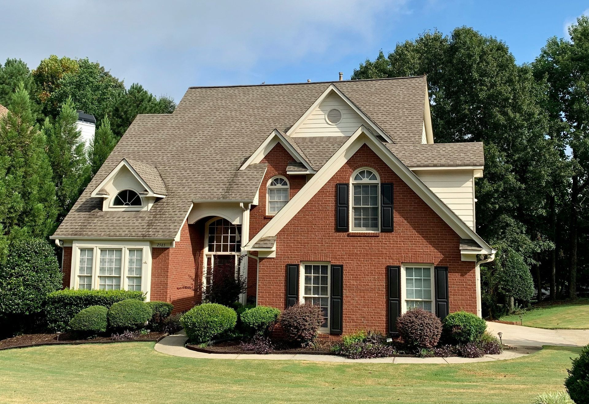
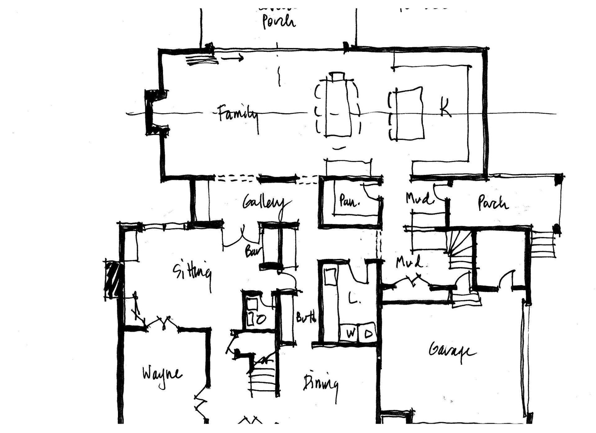
At Houghland Architecture, we design houses from both directions simultaneously: from the foundation up and from the roofline down, with both directions carrying equal weight throughout the process. This is not a workflow preference so much as a design conviction. The floor plan has to work, meaning the rooms have to be the right size, in the right relationship to each other, organized around how people actually live. The roofline also has to work at the same time, reading as a coherent form when seen from the street and resolving cleanly with the walls below it. A house where the roof is figured out only after the floor plan is finished tends to be obvious about it. The roofline ends up reacting to the walls below rather than controlling them, and the result is a house with a plan that functions well and an elevation that is forever unappealing.
The power of simplicity. There is a paradox at the heart of good architectural design that most people never see, and that is precisely the point. The houses and buildings that read as effortlessly simple are almost never the result of effortless thinking. They are the result of an enormous amount of work done to remove everything that did not need to be there, to resolve every competing idea into a single coherent decision, and to arrive at a composition that looks as though it could not have been any other way. What you are seeing is the end of a long process of subtraction, where the architect has made dozens of difficult decisions in order to make the result look as though no decision was required at all. The simplicity is real, but it is earned, and the effort that produced it is the part that stays invisible on purpose. To make your design feel timeless, do not try to do too much. Perhaps you are familiar with the quote from Ludwig Mies van der Rohe: "Less is more."
How do window proportions reveal whether a design is working?
Windows are the canary in the coal mine of residential design, because they are essentially the face of the house, and proportion is everything when it comes to faces.
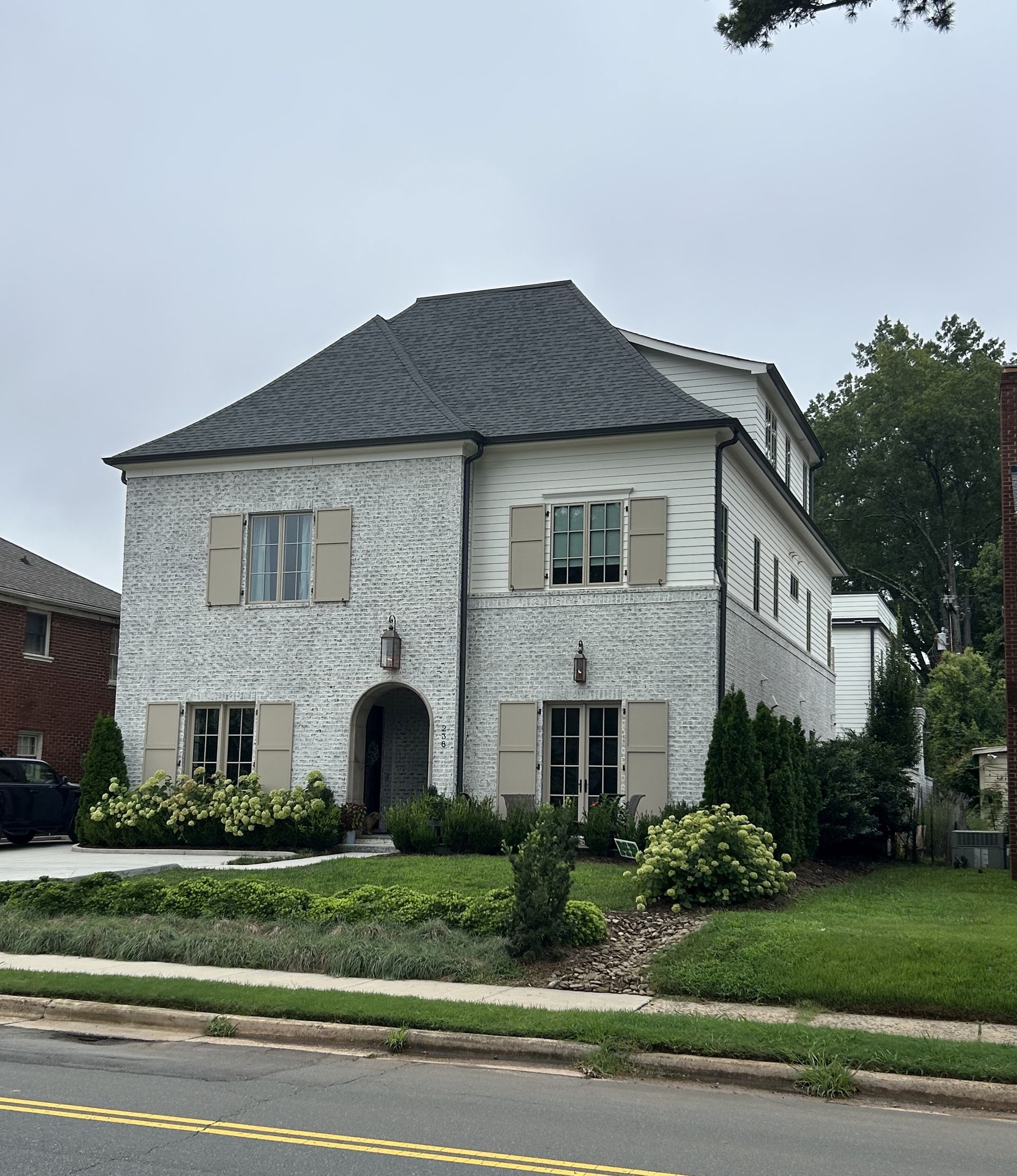
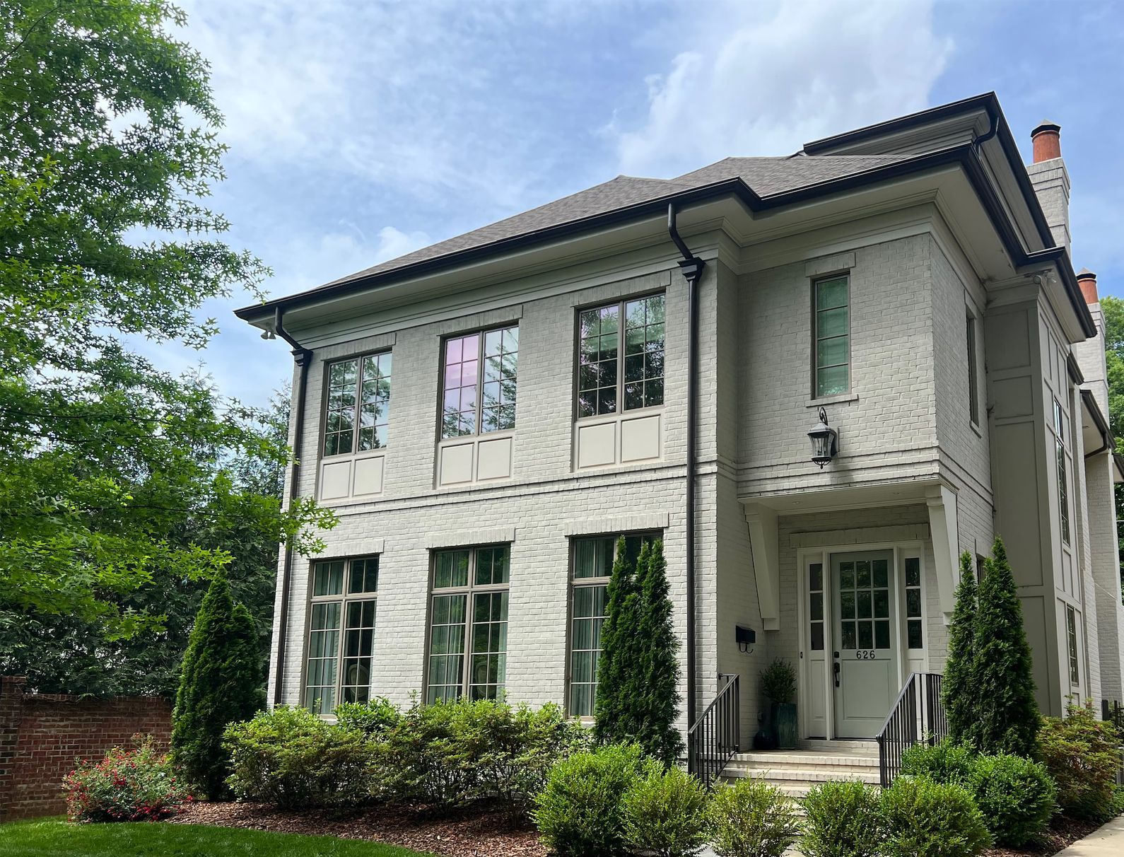
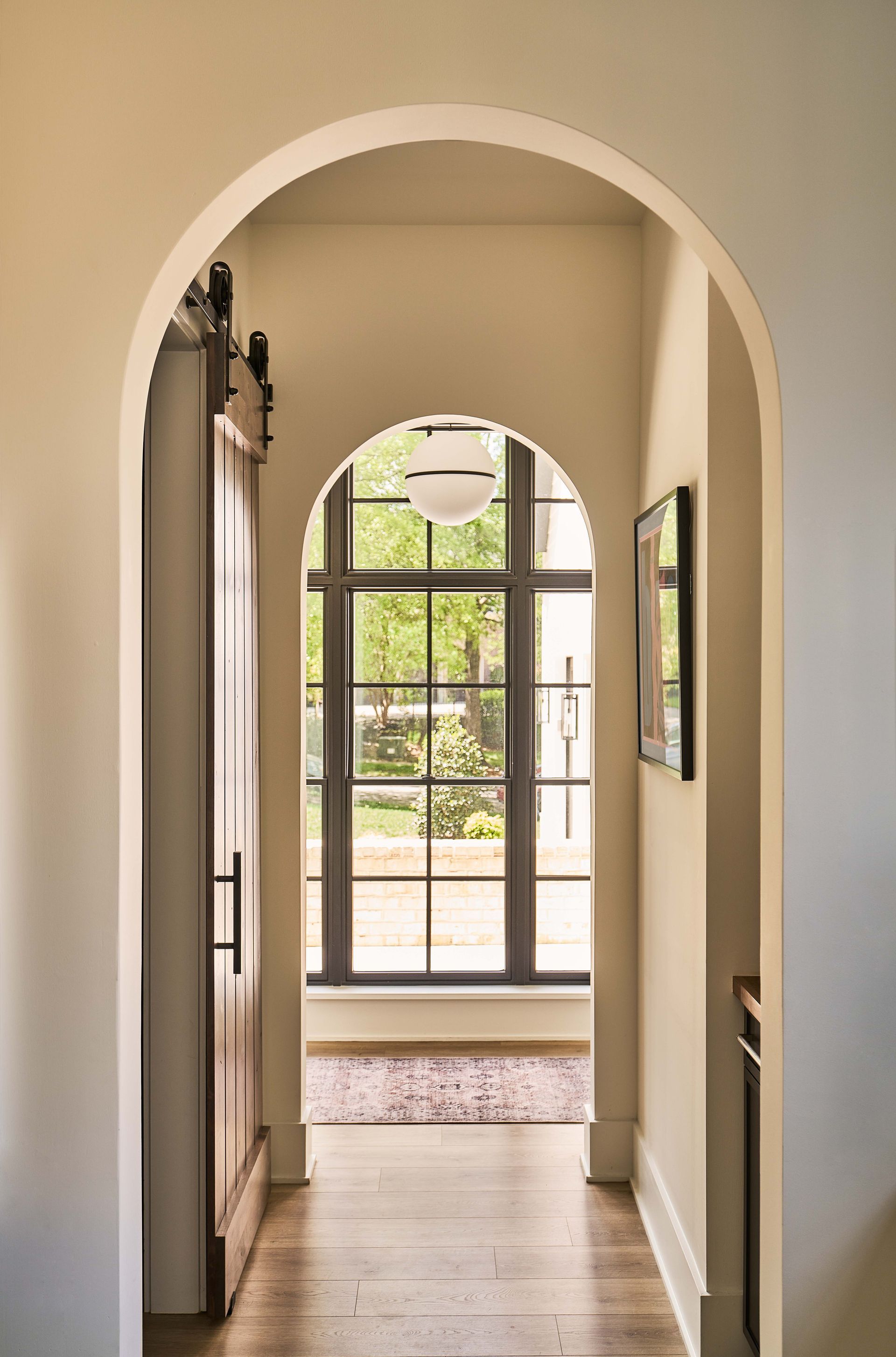
A window that is the wrong size for the wall it sits in will throw off an entire elevation, not in a dramatic or obvious way, but in that persistent, hard-to-name way where something refuses to look right. The window itself might be a perfectly good window, and the wall might be a perfectly good wall, but if the relationship between them is off, if the glass area is too large for the surrounding material or the vertical proportion does not suit the height of the wall it occupies, the facade will look off. In architecture school the concept here is called the solid-to-void relationship, also referred to as positive and negative space. Solids are the physical elements like walls and columns, whereas voids are the empty spaces between them.
This challenge is particularly acute in current house design, where houses are often substantially taller than their traditional counterparts, with ceiling heights of ten or eleven feet and long wall runs between floors that older houses never had to face. The window proportions that read correctly on a house with eight-foot ceilings do not automatically translate to a taller wall, and simply scaling up the same window type without reconsidering its proportional relationship to the new wall height is one of the most common ways that contemporary facades end up looking slightly, or sometimes very, off. It is the architectural equivalent of someone who dresses carefully but without a mirror: each piece is fine on its own, but nothing quite goes together. For students of architectural history, if you want a lesson in ceiling heights, room proportion, and the compression and release of space, please study Frank Lloyd Wright's work.
Why limit the number of materials?
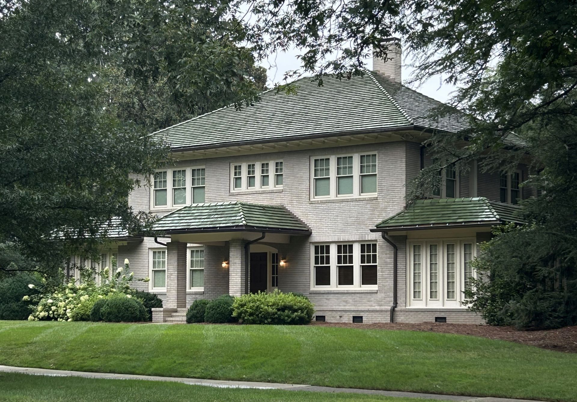
Restraint in the number of materials used on a house reads as confidence, while complexity in materials tends to read as design anxiety, the visual equivalent of over-explaining yourself to someone you are trying to impress.
The impulse to add materials usually comes from a real design problem, a wall surface that feels monotonous, a facade that lacks visual interest, or massing that needs something to give it hierarchy. These are legitimate challenges, but adding materials is rarely the most elegant solution. Better massing and a stronger proportional framework will solve the same problems with less visual chaos and far less maintenance. Every transition between exterior materials requires flashing, caulking, careful trim work, and ongoing attention to keep it looking good over time. Every one of those transitions is both a potential failure point and a real line item in the construction budget.
The Myers Park residence in our project portfolio is a useful example of this in practice. The clients wanted a traditional house that felt current without appearing to chase a trend, which is a more demanding assignment than it sounds. It requires knowing what makes a traditional house work and then operating within that understanding, rather than layering on contemporary accents in hopes that the combination reads as fresh. The solution was to simplify the roof form, get the window proportions right for the walls, and not overdo it. The result reads as confident rather than forced. That is always the goal.
Does this mean that architectural style does not matter?
Style matters quite a bit. It is simply not where a conversation about a house's design should begin, and it is not what determines whether a house succeeds or fails over the long run.
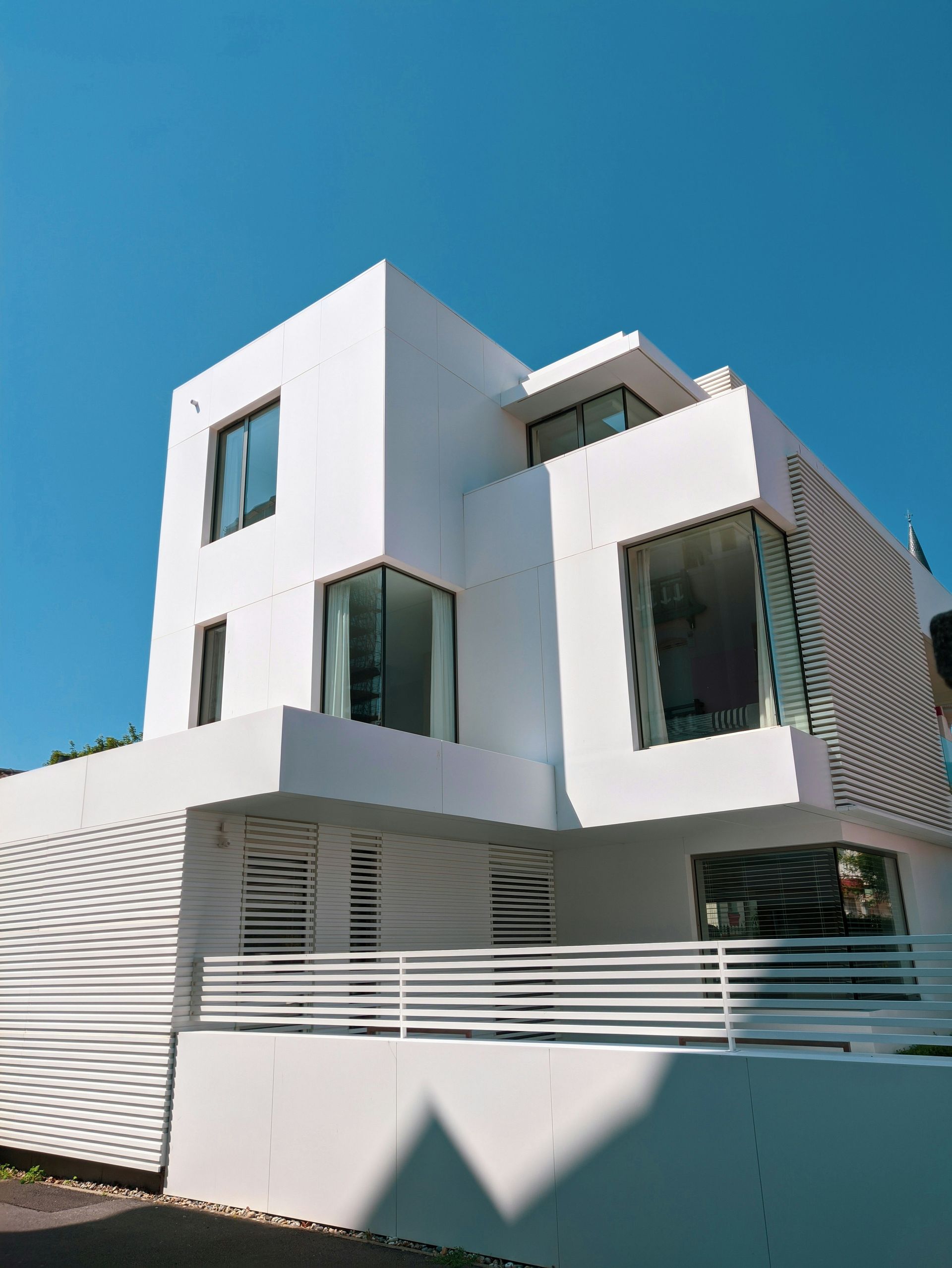
A colonial revival and a contemporary house can both age beautifully, and both can age terribly. The determining factor in either case is not the style but the quality of the design. Good proportion, honest use of materials, and restraint in complexity work in every architectural idiom without exception. A house that sacrifices those principles for stylistic novelty will look dated faster than its owners expect, because novelty is inherently self-consuming: the very quality that made it feel current at the moment of construction is what will make it feel dated later, since both qualities belong to the moment rather than to the design itself.
If you are planning a custom home and want to think through what this approach looks like applied to your specific site and program, the custom home process post is a useful place to start. And if you are curious about what an early conversation with an architect actually involves and costs, the answer may surprise you.
Houghland Architecture is a residential architecture firm based in Charlotte, NC. We design new homes, renovations and addtions for homeowners and custom builders throughout the greater Charlotte region.